
Pearl of Hope
Pearl of Hope is a non-profit platform dedicated to ovarian cancer awareness and survivor support.

CLIENT:
Angela Pearl
Co-Founder
INDUSTRY:
Non-Profit / Healthcare
TIMELINE
2 Weeks
TYPE:
Landing Page
About
Pearl of Hope is a non-profit platform dedicated to ovarian cancer awareness and survivor support. We were approached to design a digital sanctuary that would not only educate the public about the dangers of the disease but also foster a vibrant, supportive community for survivors.
The goal was to move away from the typically "clinical" look of medical websites and create a space that felt warm, empowering, and action-oriented—facilitating both event participation and fundraising.

Challenge
Designing for healthcare support requires a delicate balance. The client faced three distinct challenges:
Emotional Tone: The website needed to discuss a life-threatening illness without inducing fear. It had to inspire hope (hence the name).
Trust & Transparency: To encourage donations, the platform needed to look legitimate and clearly show how funds are used.
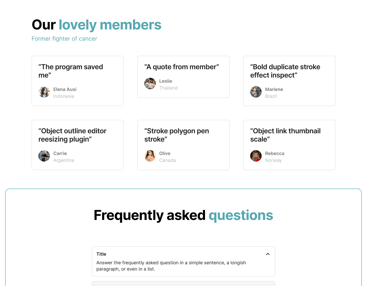
Community Engagement: Survivors often feel isolated. The platform needed to make connecting with others and joining events seamless.

Findings
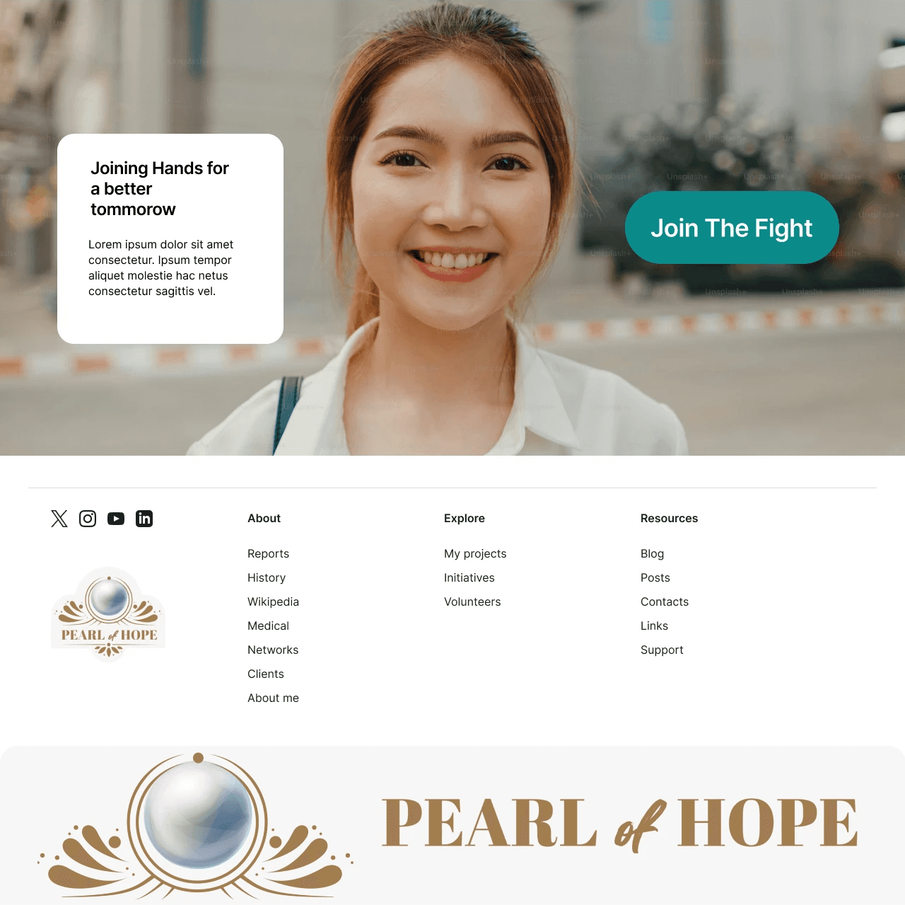
We crafted an interface centered around "Empathy & Action." By using a calming Teal palette (the color of ovarian cancer awareness) mixed with warm photography, we created an inviting atmosphere. The UX was structured to guide two distinct user types: those seeking help (survivors) and those offering help (donors).
Key Design Decisions
1. Visual Language: The "Teal" Narrative
Color psychology was crucial here.
Palette: We anchored the design in various shades of Teal and Turquoise. This isn't just a design choice; it is the global symbol for ovarian cancer, instantly signaling to visitors that they are in the right place.
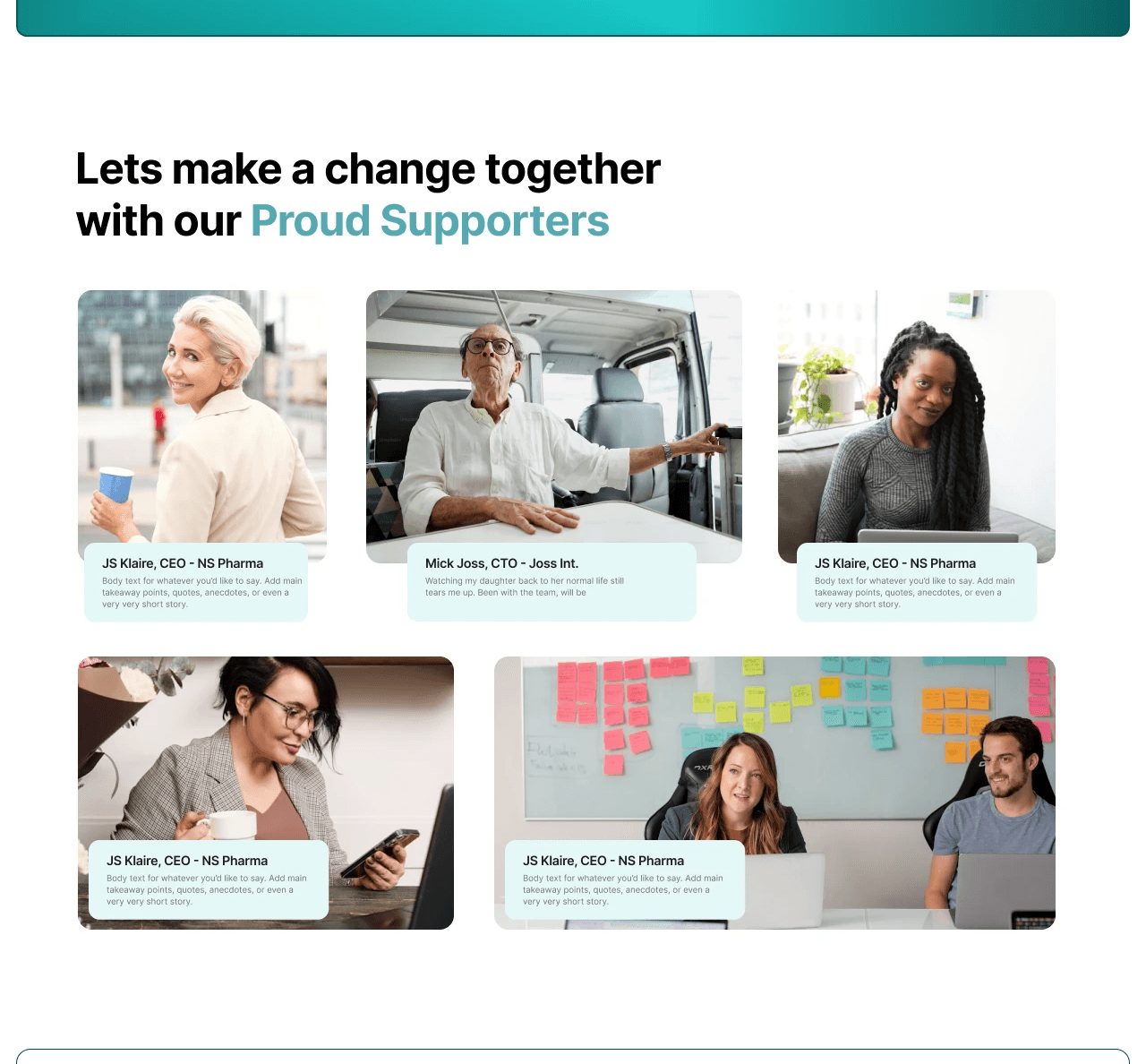
Imagery: Instead of sterile hospital photos, we selected images of women smiling, living active lives, and supporting each other to reinforce the narrative of survival and strength.
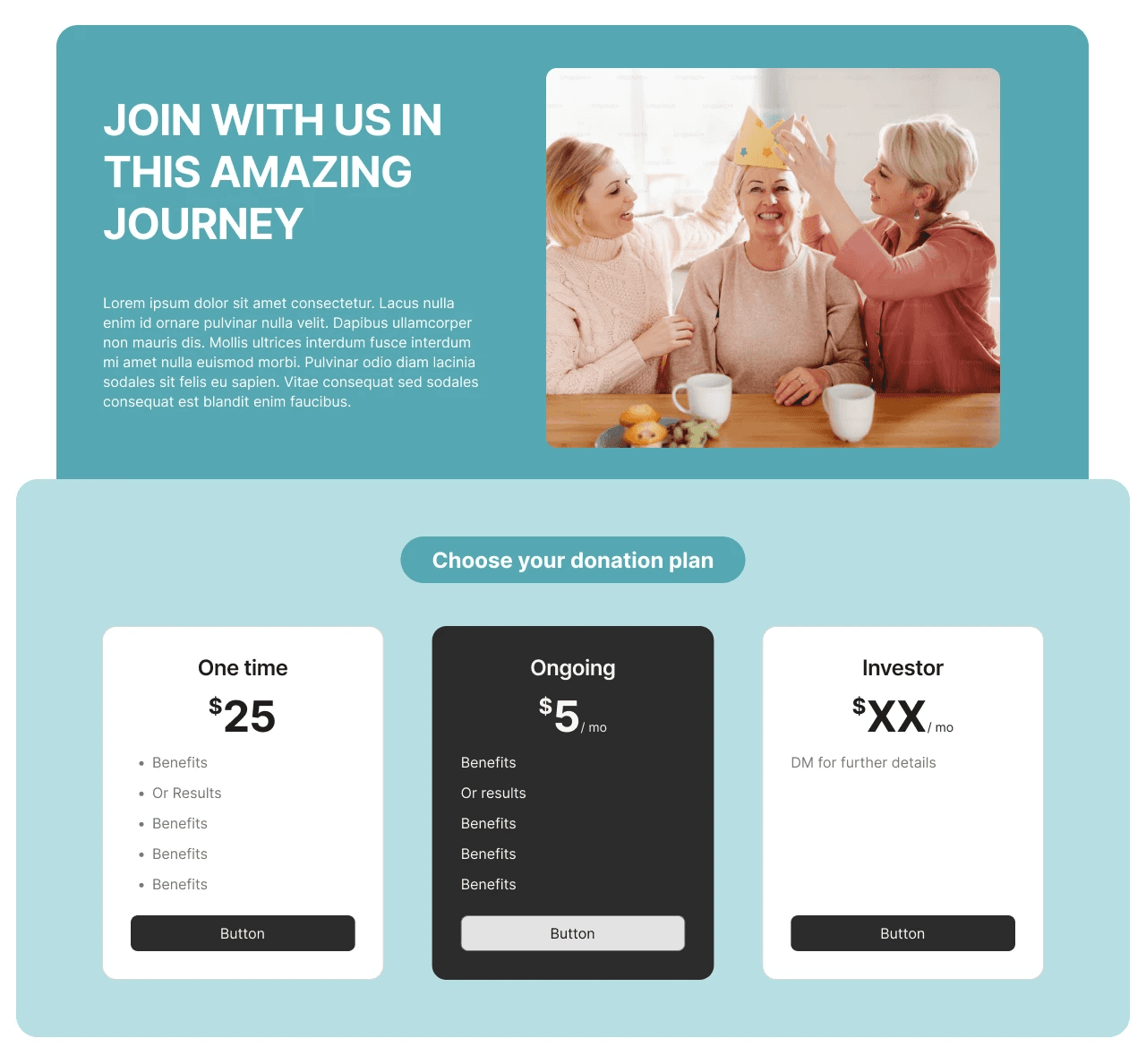
2. Streamlined Donation Flow
Donations are the lifeblood of non-profits.
Frictionless Cards: We designed clear, tap-friendly donation cards ($10, $50, $100). By pre-filling amounts, we reduced decision paralysis, making it easier for users to contribute.
Impact Metrics: To build trust, we included an "Impact" section displaying icons for "Lives Saved" and "Volunteers Joined," giving donors immediate validation of their contribution's worth.
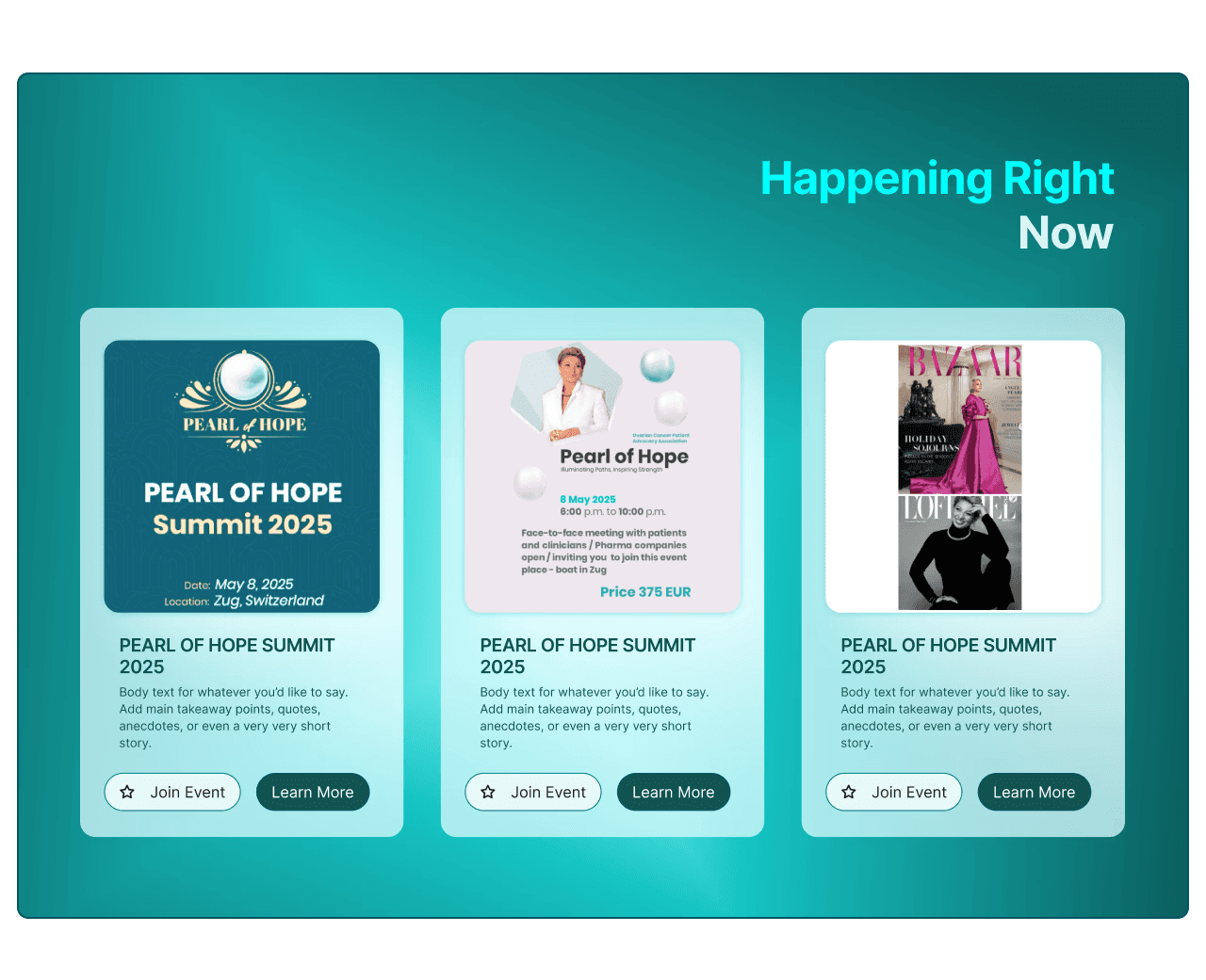
3. Event Accessibility
Community events are vital for survivor mental health.
Card Design: The "Happening Right Now" section uses a distinct card layout for events like the "Virtual Support Group" or "Awareness Walk".
Clear CTAs: Each event has a prominent "Join Now" button, ensuring that users can register without getting lost in administrative pages.
4. Education & Awareness
To fulfill the mission of public awareness, we structured the content to be digestible.
Grid Layouts: We used a clean grid to break down complex medical information and "How to Help" steps. This prevents the "wall of text" effect that often scares users away from educational sites.
Results
Pearl of Hope is now more than just an informational site; it is a hub for connection. The new design successfully bridges the gap between fear and support, resulting in a user experience that feels personal, safe, and deeply encouraging.
More to explore
Show Projects

